Showing posts with label inkscape. Show all posts

Wednesday, August 12, 2015

New project: House Cluster

Hi there! I've been of the grid for a while, sadly. But, there is a good reason for that, I've given myself an assignment. I want to practice some perspective drawing and to accomplish this I've decided to draw a "vertical village" type thing. Sort of a cluster of buildings glued on to a big block of some sort. This will give me a bunch of perspective obstacles and, also, some exercise for my imagination since I want all buildings to be different from each other. I started off drawing a three point perspective version but I soon realized that if I wanted to actually finish this project I needed to simplify it a bit. (Actually I ran into problems I didn't find an answer to.)

So next I started over but this time using only a two point perspective, hopefully this won't remove all of the feeling of grandeur that would be nice to end up with. I also realized something else, namely, using a kind of simplistic style (that was my idea all along) this might actually be kind of cool looking and I might want to print the result and frame it in a rather exaggerated size. How do I accomplish this with such a drawing? Vectors! So I'll try to do a fairly exact lineart drawing in Krita and then, in one way or another i transfer that to Inkscape to create vectors and color it there (I will probably have to retrace all the lineart in Inkscape, but, that's a later problem). It would be nice to be able to do it all in Inkscape but the perspective-helpers that kicks arse in Krita is nowhere to be found in Inkscape.

So far this is what I've managed to accomplish:
House Cluster, work in progress.
I'll try to do some guides (pun alert!) on perspective drawing in Krita in the near future, like setting up the helper guides and such.

'Til then!
10-4, over'n'out! //Niklas

Saturday, February 7, 2015

An assignment: Wired Koala

I haven't been very active lately when it comes to doing my daily sketches. For one thing I haven't had enough time (family, working out, plain working) but the last couple of days it actually depends on the fact that I received an assignment. My first requested job in arts! Wohoo!

A friend of mine saw the "Jumper" image I did, liked it, and asked me to create a character that could work as a logotype and as a "front" for one of his projects. Since I'm such a rookie and an amateur, I told him "Hell yeah! But I can't guarantee either quality or timespan and I really like to use the work and result for my own portfolio.". Deal!

Anyway, he - kind of randomly - have ended up with the wonderful nick "Wired Koala" so he wanted to incorporate that by letting the character be a koala bear, he also liked it to be sort of a super hero thing. And, hey, honestly, you can't go wrong with a super hero koala. I tried to drag out some more info about mood/color scheme/feeling/style but that was pretty much left for me to decide, but not overly stylized as a lot of logotypes tend to be.

So, added my thoughts, these are the requirements:
  • Koala.
  • Super hero themed.
  • Since he liked the Jumper I will do it in a "cartoony", not too realistic, manner. 
  • A real character, not just five lines that "gives you the sense of koala".
  • The project is about connectivity, that and the "Wired" part of the name could and should be incorporated in the character in some way.
Next step, research. Since my experience with koala bears are fairly limited, to say the very least, I needed to get a hang of how they look. Google image search was my friend here. Needless to say, I felt like a five year old girl going "naaaw", "aaaw" each time I scrolled a bit down the results. Damn, those creatures are cute and cuddly looking! Damn them for breaking my facade of infinite machoness!

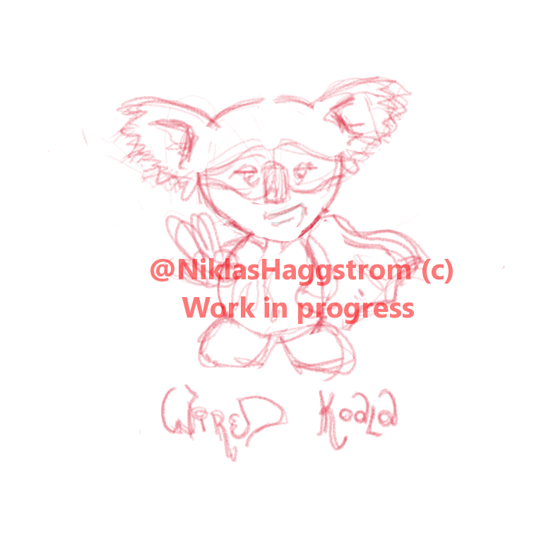
So, after gathering a few nice reference images, I believe I got a hang of how the litter critter is built and it's, at last, time to grab the pen and tablet and start sketching ideas in Krita. Pretty much from the start I realized I need to go with a semi human style, that would enable me to use a posture and/or movements that will be easily read by anyone. After some messing around I decided to go with a sort of pear-shaped body with short or no visible legs. More or less feet attached to the body. What else? Yeah, clothing. Following a super hero theme I decided to go with a cape and a tight, sleeveless, shirt. Mainly because of the simple shape of it. Further I didn't want to use a cowl because it would probably give the character a less cute and more of a tough style. I rather have it cute and cool instead of rough and tough. So for anonymity the character was given a type of Robin/Ninja Turtle style mask to depend on. I finally ended up with the sketch below where the character is in a cool pose, one hand in the waist and one hand doing the peace sign. To complement that cool feeling I gave it a sort of a smirky looking smile.

The initial sketch I decided to continue working on.
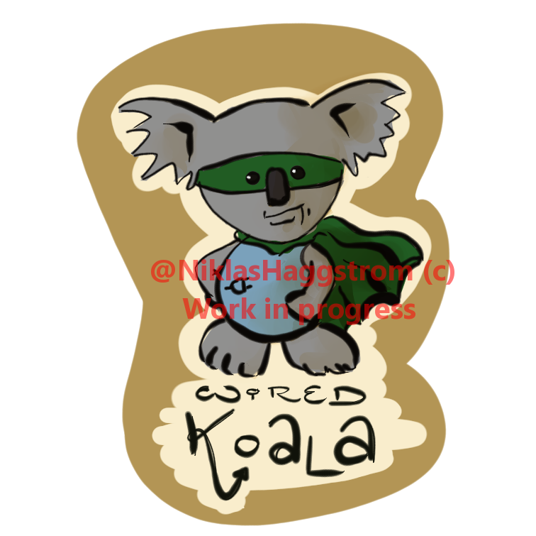
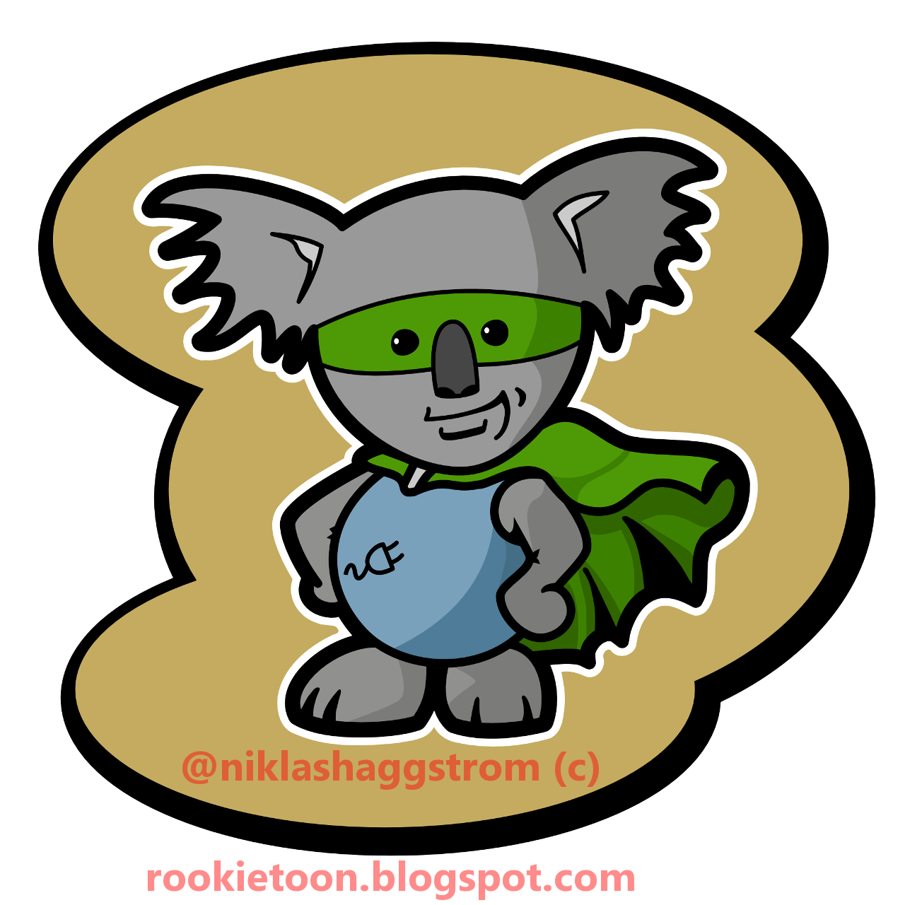
From the initial sketch it was simply a matter of painting it roughly to give my client an idea and something to discuss around. I gave the koala itself a sort of koalaish gray color, the shirt got to be blue, a color that signals professionalism, and the mask and cape was given a green, calm and non invasive color. I also threw a "super hero logo" in there on the characters chest, in the form of a electric plug. That could illustrate both the "Wired" part of the nick and the connectivity part of my clients project. For a simple backdrop I roughly painted a sort of beige area around the character. This should be enough to give my client an idea of where I'm heading.

Painting the sketch I also realized that the peace/victory sign that I'd drawn in the initial sketch didn't work so well. The koala actually rocks two opposing fingers, instead of just one like we have. The two-thumb-look simply looked strange so I skipped that for now. That'd do for now, so I sent that to the client for feedback, being very clear on the fact that this is very much a FIRST DRAFT. 

First concept idea sketch.
I actually received nothing but positive feedback from my client. Apparently he understood the concept of "first draft" and was able to ignore the messy paint and get a feel for the relevant stuff such as the idea, the attitude, the style and such. 

Since the idea sketch was a success, there was really no need to change much. One thing he asked me, though, was if it was possible to export drawing into some sort of vector format. This made me think. Since I still haven't really come to a point where I can do super nice lines and clean ink full of life and whatnot I decided to do the lines as vectors in Inkscape first and then, later, colo2r it and add shadows in Krita or Gimp. Or, wait a minute, why not draw it in its full using vectors? That would give me two things: 1) The option to scale the image a lot without loosing quality. 2) The ability to easily modify specific elements in the image. Vectors it is then. All the way. This would be a nice opportunity for me to learn more about drawing vector graphics. Yay! Learning: Good!

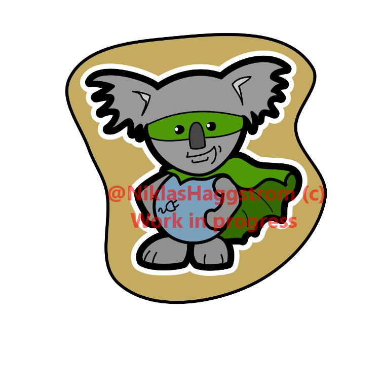
So, the evening after the first rough sketch I imported it into Inkscape and started to manually trace the lines and slightly adjusting details. The only thing I actually changed was the feet of the character. I had neglected those in the sketch so they needed a shape-up. I also gave the cape and the mask a lighter color than I had used earlier just to make the character look kinder and more of a "good" super hero. I emphasized the outline with a wider border plus an extra white border to make it pop and also to make the image work without the backdrop on both white, black or colored background.  

First iteration of the vector image.
The feedback I received after showing my client this first vector version was somewhat overwhelming. He was super happy about the image and almost had it printed on shirts. I managed to cool him down a bit though. Enough to make him let me finish the work. Thanks mate! ;-)

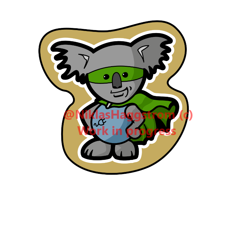
The next evening I focused on shades. I also eliminated all borders in the drawing, turning them into separate shapes, this allowed me to adjust some lines to make them a bit more alive and "realistic". For example the smirk and the lines that indicates the toes. I finally managed to make the right (from the viewers perspective) arm look good too. 
Vector image second iteration?
I gave the image one more evening, tightening up the outlines and making minor adjustments. I also took time to separate some shapes into different layers. That will enable me to hide the shades to just show flat colors or the backdrop or even the body so that my client can use only the head if he'd like to. 

Final version of the image.

So, that's it! The images are sent to my client and, now, even the documentation is done. I am very happy with the result and, for the record, so is my client. 

+1 and/or comment if you liked it or want to drop some critique.

10-4! //Niklas

Wednesday, November 26, 2014

The Air Bass Player - Drawing tutorial

Cartoon drawing tutorial. Everything from sketching to inking, coloring to shading and some finishing touches. I'm a beginner in this area and this was how I did it. My workflow for this particular illustration. It worked for me, maybe there are better ways to do it. If you like this tutorial, hit me with a +1 and/or a comment at the bottom. If you got some critique, please, leave a comment or send me a message. Thanks!

Background

I was listening to a podcast some days ago, where they asked the Question with a capital Q: Is air bass considered a dance or not. The conclusion was that, yes, air bass can be called a dance. As far as I consider, yes it is, but if done at an after ski with slalom boots on ,it's an art. An art that few master. I'm one of the happy few that have had the honor to, on multiple occasions, experienced, up close, the work of such a master. Anyway, the aforementioned discussion brought forth an image in my head. An image of a man, in slalom boots, playing air bass. An image I felt an urge to get on print. So, this image is what this post will be about.

Pencil

The day after the epiphany above I took my daughter and her friend to their ballet practice, this usually means forty five minutes of waiting in a gymnasium dressing room so I brought a sketchpad and a set of pencils. The task of sketching the image was a fairly straightforward one, since I had a day of thinking about it and coming up with the picture pretty clearly in my head. Technically and practically it was a slightly bigger ordeal. Since my pen skills are, at best, limited I'm happy to have a good eraser.
Initial pencil sketch.

Ink

When we got back home I scanned the sketch in my printer/scanner combo type thing (Canon MP640) and opened the scanned result using Inkscape. Now it was time to start doing the linework for my image and I want a simple style with clean "ink" so I'll go with drawing paths for all the linework. This is straight forward, just create and edit the paths so that they match the scanned sketch where it needs to match and make adjustments where needed. Go nuts! Time consuming work so make sure you hydrate appropriately. For linework I prefer a good Zinfandel or Amarone. For coloring, IPA's the way to go.

First I start by simply (well...) creating the paths over the lines of the sketch using my the mouse. Just to make my new lines more visible over the pencil strokes i use a red stroke color.
Start to trace the sketch's linework.
Continue doing this for all elements in the picture.Tedious? Well, yeah somewhat, sometimes.

Vectors to the left, vectors to the right...  
When all lines are traced the only thing left is to clean up and remove all hidden lines. My guess is that if you wanted to do an all vector graphic type thing instead of removing hidden lines you'd add fill colors to the different segments and make sure everything is stacked in the correct order bottom to top. But me, now, I just want some nice lines.

Clean up and remove hidden lines.
After cleaning up i hide the background pencil sketch and set the stroke style to all black and 6 pixels wide. Why 6 pixels? Well, simply because that's what looked best.
End result of the Inkscape part of the process.

Import into Gimp

For this image I want to add some shading to the color so I'll utilize Gimp for this. I select all my work in Inkscape and CTRL+c (copy) it all, then I open Gimp, create a new document, A4 size, portrait and 300 pixels per inch and then CTRL+v (paste). What? Nothing? Still all white? As far as I can see it wasn't possible to copy/paste between Inkscape and Gimp. 
But... 
Wait a minute... 
What if... 
Maybe I didn't copy/paste the actual image but rather the underlying paths? I flip over to the Paths-tab of my toolbox in Gimp and guess what? Ta-daaa! There it is!

My dear pasted Inkscape data.
The beauty of this is that, since we copy the vector paths there's actually no reason to worry too much about the size of your sketch or your linework/inking in relation to the finished image. Now we can just resize it here in Gimp as we please and there will be no loss of quality. 
First, make the path visible by clicking the - sadly - invisible eye icon (aka "The eyecon", tihi...). This will display the lineart in red on your document. In my case the path was too small so I had to resize it. Select the Scale tool in the tool box, in the tool options select Transform: Path and check the Keep Aspect box and click your path, this will display a grid and a preview on your workspace. Now you can move the path by grabbing and dragging  the circular center handle on the grid and resize it by doing the same to the square corner handles. Hit ENTER when you're done.

Resizing the vector paths.
Since we imported the paths rather than the bitmap from Inkscape we need to stroke the vector, if you know what I mean... (that never gets old). Create a new transparent layer, called something clever, like "Ink". Then select the path and pick a foreground color for your ink, I'm still going with a black, and in the main menu select Edit > Stroke Path... 

Stroke Path dialog
I'm after straight, simple ink so I'll just pick a solid color stroke and go for a 10 pixel wide line. Actually I had to try some different width settings and undo, try again, until I found a width that worked for me. After that, hide the path again by clicking that "eyecon" to reveal the result. Now would also be a good time to save the progress and change from inking to coloring beverage. 
A nice set of lines in Gimp.

Color

After we got our lines sorted out, time to color the character. First, create a new transparent layer, place it below the ink and name it "Color" or something like that. Then we continue by filling the different areas with appropriate flat colors, to do this I used this method:
  1. Select the Ink layer, then use the Fuzzy Select Tool to select the area where to apply a certain color.
    Fuzzy Select, hard to see the selection but look hard and you'll find it.
  2. In the main menu, select Select > Grow and enter a value right below half of your stroke with. I selected 3 pixels. This will force the color to fill the entire area and slightly underneath the Ink.
    Grow selection
  3. Now pick a fill color, remember that we will apply shadows later so don't go super dark on these flats.
  4. Important: Make sure you select your Color layer.
  5. Fill the selected area using the Bucket Fill Tool.
    Bucket Fill
  6. Pick another area, go back to 1 and repeat the procedure until all areas are filled with nice flat colors.
When I'm done with filling the flat colors I have the result below. Looks good to me.
Flat colors applied.
Hide the Ink layer to check that no colors disappear, that would mean that you have colored the Ink layer which is not good and you'd have to undo your work for a bit.
Flat colors, no lines.
So, now I'm done with the flat base colors and it's time to move on to shading.

Shades

To start with I create a new layer called "Shading", place it between the Ink and the Color layers and then create a layer mask to this so that I don't risk shading the background. To create the layer mask I follow this procedure:

  1. I make sure the Ink layer is active and, using the Fuzzy Select I select the background areas (beside the character and - in my case - between the arm and the body)
  2. In the Layer Stack I right click the Shading layer and select Add Layer Mask...
    Add Layer Mask dialog.
  3. In the Add Layer Mask dialog I select "Selection" and "Invert Mask", this makes the unselected areas paintable and the areas that was selected will not be affected by the shadowing.

This is what the Shading layer is looking now in the layer stack:

Shading layer with mask.
 I also set the Mode of the Shading layer to "Multiply", this will make all areas painted in this layer darken the layers below, so, transparent or white in this layer will not affect the outcome but a darker gray will darken the color of the layers below, so that, for example a blue flat color in the Color layer will be of a more dark blue. This without really affecting the actual paint color in the Color layer.

At this point it is time for me to bring forth the mighty Intuos. I also need to decide in what style my shadows will be. I decided that my rules for the shadows in this image:
  • A distinct separation of shadow levels, something like cell shading. In other words no fading.
  • The light will come in from dead left to right.
  • I'll have three levels of shade beside the original, untouched flat fill:
    1. Not in direct light.
    2. Dark. (In the opposite of direct light)
    3. Very dark. (Especially dark places like the armpit and such)
Since I don't want any fading but rather sharp edges of between the levels of shadow I set the paintbrush in Gimp to use a basic circular brush, Hardness: 100. This will create distinct strokes with full opacity throughout the width of the stroke. I also set the Dynamics of the brush to "Dynamics Off", this will disable pressure sensitivity between the pen and the tablet and the strokes will always be the same size and opacity regardless of how hard I press down the pen when I paint the shadows.

When I've set up my brush I need to find a suitable gray tone for my first level of shadow. This is just a matter of trial and error for me since I haven't done this before. Pick one gray and try to paint in the Shading layer. Keep in mind that at this level the shadow should not be too dark, more darker tones will come later. when I found a tone that seemed to be ok I tried it on all flats to see if it worked throughout the image. I ended up with #E5E5E5 for this level. Using this color I painted all of the character that - as far as I could see - had no direct light hitting it. Since I've decided that light will come from the very left, this is practically the entire right side of the character.
After first level of shading.
Now find an appropriate tone for level two shades (for me: #CCCCCC) and paint that as well. For me this was the rightmost parts of the body and limbs as well as some details on the face to make it a bit more alive.

I was very economic with the third level of shading (#999999) I just used some in the hair, armpit and groin and on some other details. Very scarce though. When I've done these shades and start to feel happy with it the character itself if done. From here it's just bling bling.
After shading is finished.
Hiding the Color layer now allows the Shading to affect my white background. This shows that if we would like to change the color of the characters shirt after shading, we can just replace the ble with a different flat color and we will still keep the shadows in place. That's neat.
Hiding the Color layer shows the shadows alone.
To give the the character a bit more life and to emphasize the dancing I add some motion lines. To do so I actually used Gimps path system. I have a hard time dealing with paths in Gimp. This is something I've got on my to-befriend-list. What I did for each of these lines independently was this:

  1. Create a path using the Paths Tool by creating two nodes.
  2. Motion line path.
  3. Grab the path between the nodes and bend it by dragging with the mouse. If needed, adjust the path using the little square handle thingies of the nodes.
  4. When satisfied with how the path looks, it's time to stroke it. Yeah, stroke it... Hrm... Well...
    Now I'm not after a flat, plain, straight line, but rather a line that starts and ends thin and bulges in the middle, "swooshy" is a word that would describe what I'm after. This can be accomplished by stroking the path with a Paintbrush and selecting "Emulate brush dynamics". You might have to mess around with the paintbrush Tool Options a bit to find the settings that works for you. It's again a matter of try, undo and try again.The settings below worked for me.
    Stroke the path, stroke it good!

    This is how the final motion line ended up.
    Final motion line result.
  5. And this is done all over for all other motion lines.
Added motion lines.
Now there's just some finishing touches left before we can call this a day. At this moment all lines are the same width but I'd like the outlines to be a bit heavier. So what I do is this:

  1. I create a new layer "Heavy Outline" and place it below all ink, color and shading.
  2. I select the Ink layer and use the Fuzzy Select tool to select all lines.
  3. I activate the Heavy Outline layer.
  4. In the main menu, I hit Select > Grow and entered 6 pixels.
  5. Then I used the Bucket Fill tool to fill the selection with the same color as my ink. Now the color and ink will hide everything but the wider outlines.

After this I added a simple background by using a radial Blend Tool and added a "signature" to the bottom of the image. I also added an extra, white, outline to the character to really make it pop and separate it from the background. I do this by doing the exact same routine as above, on a new layer "White Glow" but instead of growing the selection by 6 pixels, I grow it by 20 pixels and then Feather it by 3 pixels to make it extra wide and also smoother. NOW I'm happy with the image. Quite ok for a rookie, right?

The final Air Bass Player.
This has been a tough tutorial to write but at least I got a few stuff on "print" so that I myself don't forget them. Now, some much needed sleep.

10-4 //Niklas

Update: I just needed to do one of these process animation type thingies, here it is:

Process animation.


Wednesday, November 12, 2014

The taco infographic

Line of thought:

  • Sweden loves tacos.
  • Sweden is full of hipsters.
  • Hipsters can't eat simple Average Joe tacos like everyone else.
  • What would a hipster taco look like?
  • Can I illustrate this somehow to incorporate it in my little project? (Project Background)

So, I sat down and thought it through.What I came up with was this:

  • No characters.
  • Infographic.
  • Draw a taco, keep it simple.
  • Write a list of "ingredients" included in the taco.

Here follows a step-by-step type thingy about how I created the taco-image.

1) Roughly draw the geometrical helpers and outline the shell.
This is done using Gimp and the Wacom tablet. Keep it messy!
 2) Continue defining the general look of the taco. Here I've also outlined the other elements of the "infographic". As you can see, I have no control over the pen. Messy sketching and extensive erasing are my best friends.

 3) Now I have a general idea of how I'd like the thing to look. Time to start drawing some more distinct lines and cleaning up the sketch.
 4) So, now I have a good enough sketch. At least I believe I have. For this occasion. I now export the image to a bitmap and import it into Inkscape. Then I start to draw paths along my lines. One by one.
 5) Continue drawing paths until your'e done.
 6) When done, just add color. I'm after a flat and simple look so I'm just going to add some basic fill colors to each element. I also make all lines black and double the thickness of the stroke on the shell to make that pop.If I wanted some shadows and structures I'd probably take this into Gimp and go nuts but I leave this as it is. I'm happy with it now.

7) The last step is to export this as a bitmap and head into your favorite DTP-application and add text and other graphical elements. The result of my work can be seen below, in Swedish.


10-4 //Niklas

Sunday, November 9, 2014

Setting up my digital environment. Part 2 - Software.

So, the target is set and we're now working on getting the right tools in place. In my last post I talked about how I got my Wacom tablet set up properly (enough). Now, I don't want to  spend a nice hardware set up and a good intention on Microsoft Paint so I need some software to help me in my quest. I've dabbled with Inkscape on some occasions, creating icons for software I've written, so I'm going to try to keep using that. Inkscape is a program for editing vector graphics, like clip art and such. Inkscape is a nice and free replacement for Adobe's Illustrator, more than able enough when it comes to manipulating paths. I wonder if there are some other nice (and free) tools out there?  After a quick googlearound I found this gem of info on the lifehacker site: Build Your Own Adobe Creative Suite with Free and Cheap Software. I've used Gimp (Image processing software. Free, open source replacement of Adobe PhotoShop) before and I can see how that would be valuable. I'll install that and leave the rest for now.

Jumping into Inkscape it soon becomes pretty obvious that just straight up drawing in Inkscape using the tablet is a completely hopeless task. Modifying geometric objects, bezier curves and such using the tablet isn't very smooth either. Probably it's possible to master that in due time but.... naw ... for Inkscape, I'll stick to working with paths using the mouse.

Now, diving into creating a character using Inkscape is sort of building with blocks. Creating different geometrical elements and paths, joining them and modifying the lines and nodes to strive closer and closer to the desired result. Something like the steps of my drawing below.

Direct drawing in Inkscape.
Direct drawing in Inkscape by modifying objects and paths.

This process is quite straightforward and it gives the artist great control. If a line doesn't seem quite right, just bend it a bit or move a node or something to manipulate it until you're happy. I have one problem with this methodology though, it's extremely hard - for me at least - to predict the end result early in the process. As you can see in the illustration above, it's really not until the fifth iteration of refinement that you can actually start to define the characteristics of your... eh... character. For a one shot illustration this will work just fine, but if you're want to draw a character that has a lifespan that stretches before and maybe after this certain illustration it will become difficult - I think - to start your drawing in a way that will lead you to the result you're after. For me this is where I believe sketches come in handy. Maybe now I can - at last - start using my tablet.

Plugging in the tablet and firing up Gimp I soon realize that something isn't really the way it's intended. Making sketches, for me - a man with no pencil control - is a matter of making a lot of faint lines until I have something close enough to what I'm after and then defining the lines with some more distinct strokes and a lot of erasing. What I get in Gimp now is nothing like that.

My first sketch made in Gimp.
What I need from my tablet (and is said that it can deliver) is some pressure sensitivity. Now despite how hard/soft I press the pen on my tablet the lines are all the same width and color. No like. After searching the Internet for quite a while, reading a bunch of articles and watching numerous YouTube intros I found this YouTube clip:
How to Configure a Wacom Intuos Graphic Tablet Pen
An extremely clear, straightforward, informative and well made tutorial on how to make a Wacom Intuos tablet work well with Gimp. The clip is made and published by somebody called VscorpianC, thank you very, very much +VscorpianC! Well done!

Sketch in Gimp, now with pressure sensitivity.
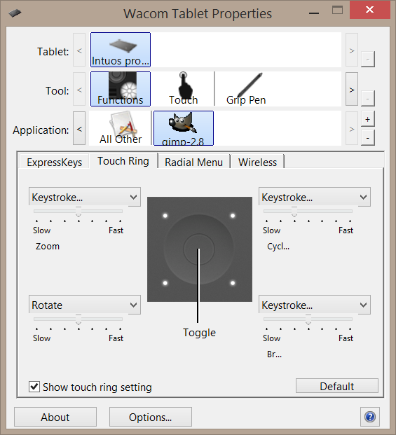
Aaah, that's better! The aforementioned tutorial also enabled the back of my tablet pen to work as an eraser, THAT, I NEEDED! Now I've got a way to actually draw, using my tablet directly into Gimp to create sketches. Bless! Working with the tablet and Gimp reviled quickly some minor quirks. My tablet has some kind of a scroll ring type area to one side. The ring has a button in its center where you can toggle the function of the ring. These defaults to Scroll, Zoom, Brush size and Rotate. The problems I've got is that neither Scroll och Brush size seems to work in Gimp. It would be nice to get them to work.

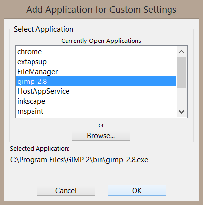
I've noticed my cursor going nuts when messing with the touch ring so I know it does something. Going into the keyboard shortcut menu in Gimp I learn that the zoom out/zoom in commands are mapped to "+"/"-" and the decrease and increase brush size commands are mapped to the brackets "["/ "]" on the keyboard. I open up the tablet settings and define a new setting for the Gimp application.

Defined applications
Add the Gimp-application
After that, select the new application and set it up by configuring the key strokes for the different modes. While I'm at it I configure one mode to work as Toggle Layer. I find, in the Gimp keyboard shortcut setup that the Page Up and Page Down keys jumps to the layer above/below, so that's what I set in the Wacom config.

The Wacom tablet config.
Well, now I've got my digital environment set up all nice. I've installed Inkscape and Gimp and managed to get my Wacom Intuos Pro tablet working all fine with Gimp. Now I have noting but myself to blame if I suck. Anyhow, that's all for now, I hope to be able to get some creating done in the near future.

10-4. //Niklas